Identify Friction
Pinpointed where users hesitate in the decision process, especially between browsing and committing.
Creative Project Manager | Creative Producer
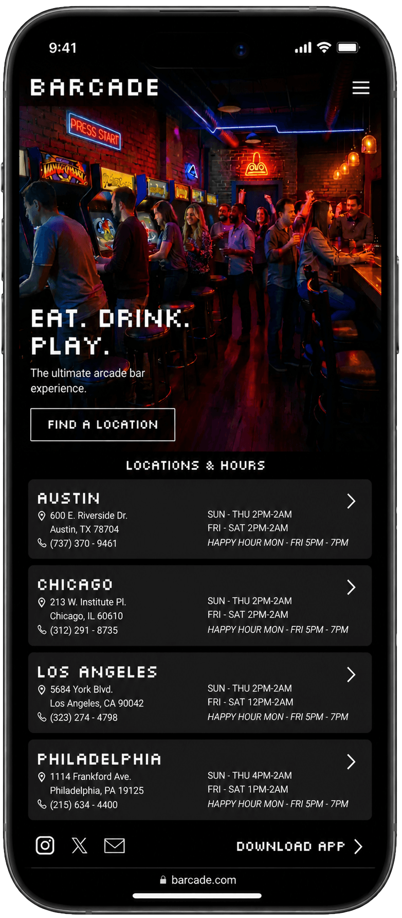
App-first experience built to make choosing where to go feel faster and easier.
I focused the product on reducing friction between intent and action in Barcade’s existing experience. The concept reframes discovery as a fast, guided path to decision, prioritizing clarity, fewer choices, and momentum over feature depth. The result is a system designed to move users from “nothing to do” to “I’m going out” with minimal hesitation.
People want something to do. They just don’t want to work to find it.
The concept started from firsthand use. As someone who enjoys Barcade, I found the existing experience made it harder than it should be to quickly decide where to go, what to play, or what was happening next. That friction matters because people often default to passive scrolling when they’re bored, even when better options exist nearby. This direction was informed by firsthand use and observation of how people hesitate when deciding what to do next.
The challenge was to redesign that experience in a way that reduces friction between intent and action, helping users move from “nothing to do” to “I’m going out” in as few steps as possible.
The problem wasn’t a lack of features. It was a lack of clarity in how to act.
This work focused on defining the right decisions to reduce friction, not adding more features. Grounded in common hesitation points in real-world usage, the goal was to shorten the path from browsing to commitment.
Pinpointed where users hesitate in the decision process, especially between browsing and committing.
Simplified paths and removed lower-value options to keep momentum toward action.
Used hierarchy and structure to make the next step obvious at every stage.
Tested pacing and transitions to ensure users could move from discovery to decision without hesitation.
Reduce hesitation. Navigation was intentionally compressed so users could move from curiosity to commitment without working through unnecessary steps.
Focus on intent. The experience centered on the decisions users actually make first: where to go, what’s happening, and whether there’s enough reason to leave the couch.
Protect momentum. Features that slowed momentum were intentionally deprioritized so users kept moving forward instead of drifting into passive browsing behavior.
Create consistency. The app and website were structured around the same decision path so users could enter from different touchpoints without relearning the experience.
Prioritizing speed meant reducing some exploratory depth. Users can move through the experience quickly, but the system intentionally avoids over-expanding secondary browsing paths.
Keeping the app and website aligned required limiting platform-specific behaviors so the overall experience stayed consistent and predictable across touchpoints.
Some flexibility was intentionally removed to maintain momentum and reduce hesitation during decision-making, even if it meant sacrificing more open-ended browsing behavior.
Early sketches helped map the product path, focusing on speed and clarity over feature depth. The lo-fi prototype tested whether that direction felt easier to act on before moving into polished screens.
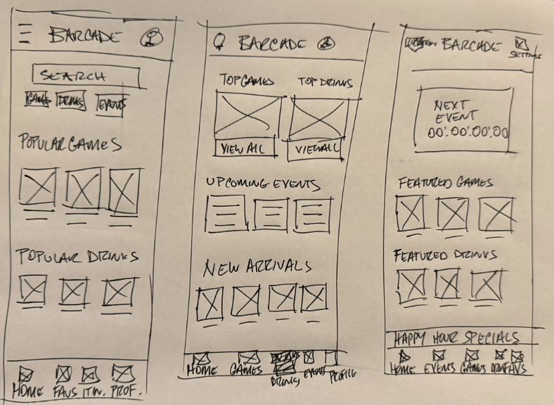
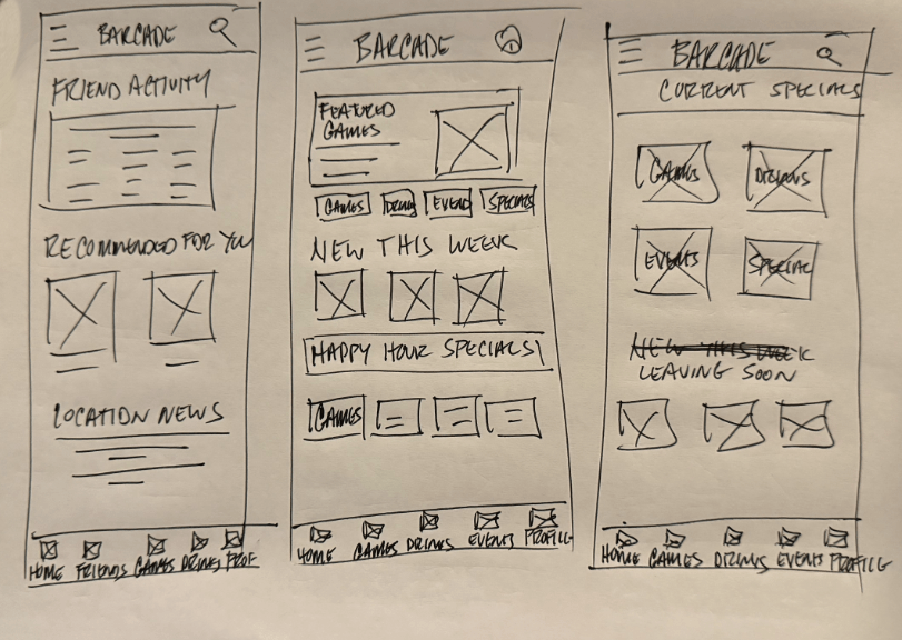
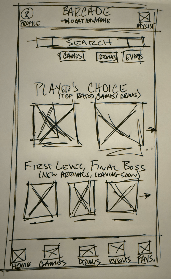
Press play to see how the early wireframes move from browsing to action, with less hesitation between steps.
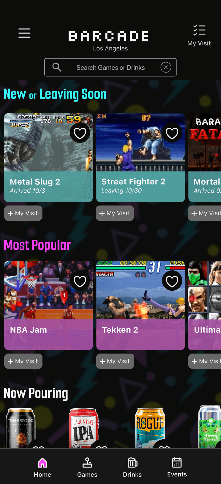
The final direction treats the app and website as one system, designed to move users quickly from discovery to action. The result is a faster path from intent to commitment, reducing hesitation between “maybe” and “I’m going,” and increasing the likelihood of action.
Press play to see how the experience moves a user from browsing to choosing a reason to go out.
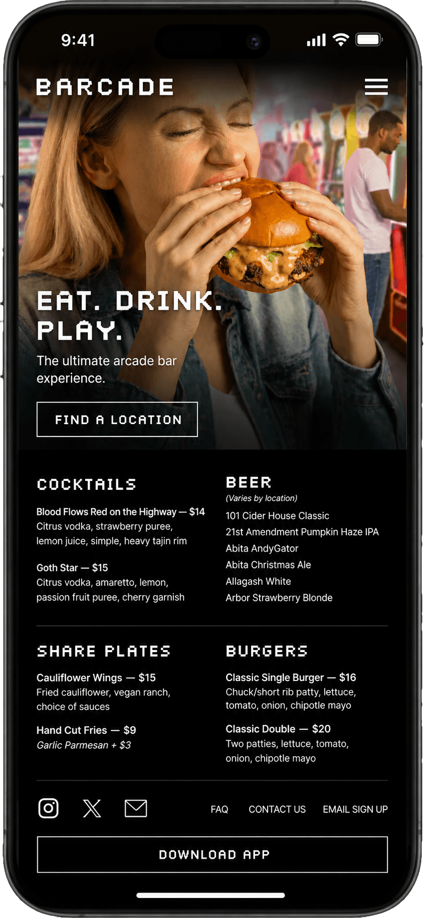
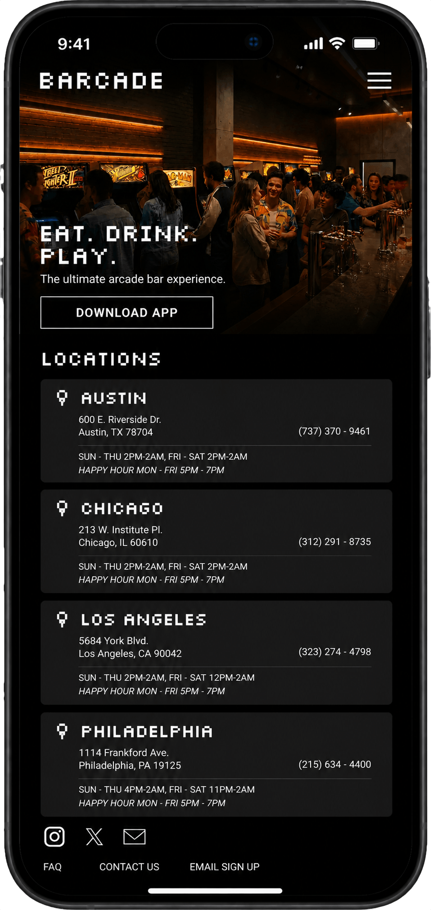
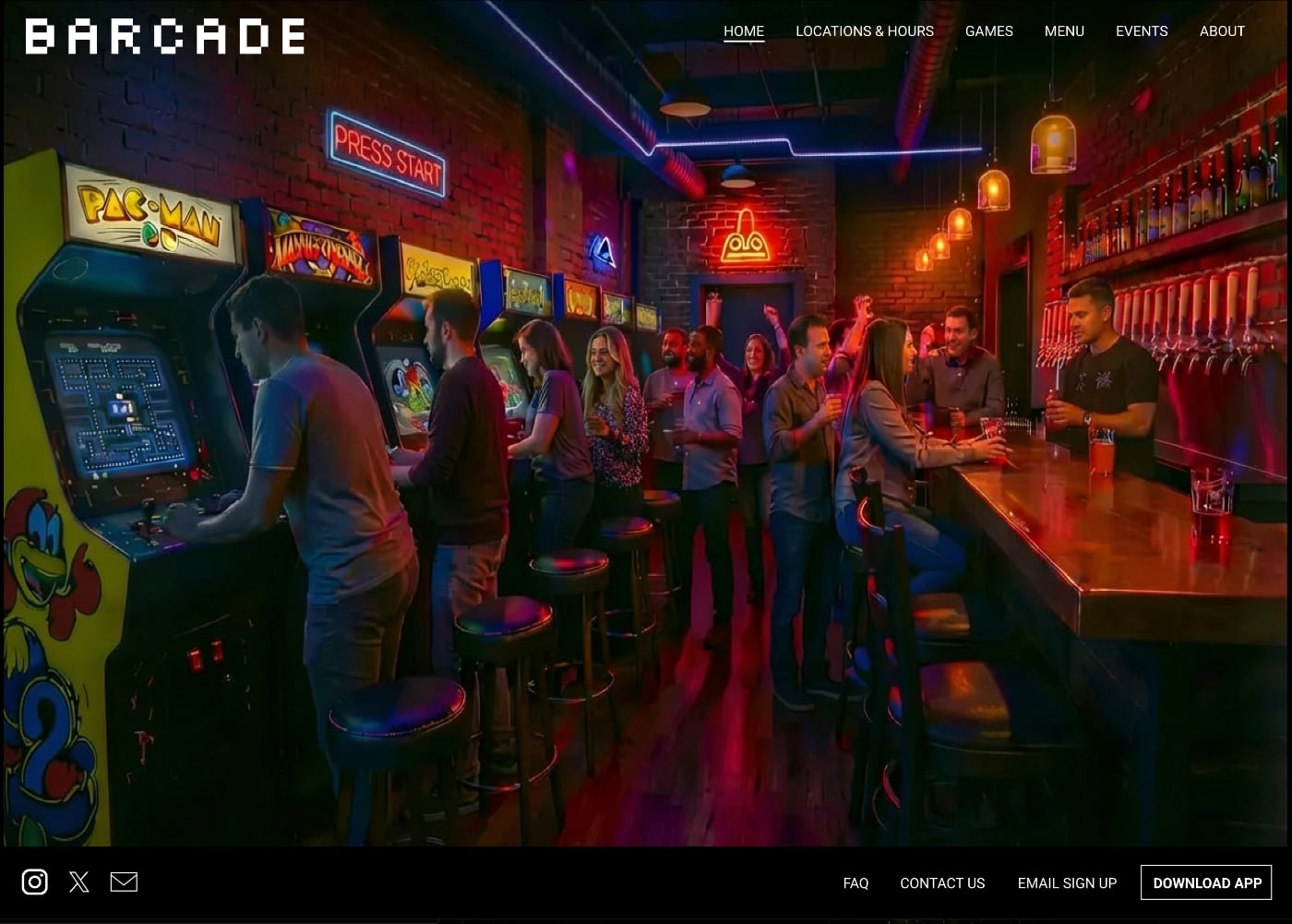
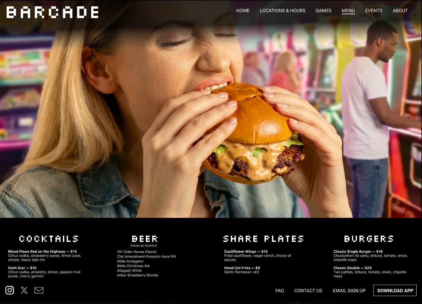
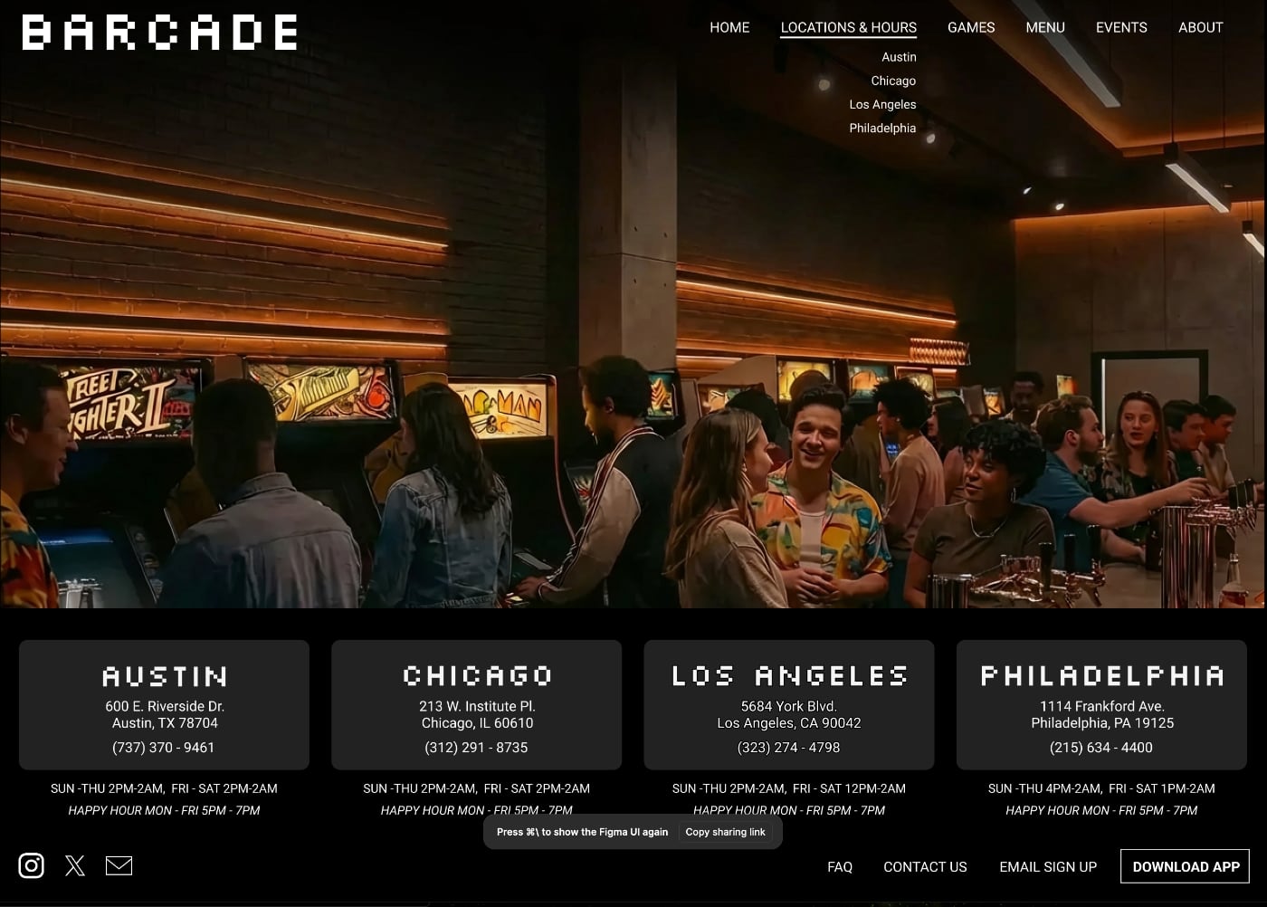
The website reinforces the same goal from a wider entry point: quickly understand locations, food, games, and reasons to go.
The goal was not to design a feature-rich app. It was to move users out of passive browsing and into clear action. Each decision was made to reduce hesitation and create momentum.
This is the same thinking I apply when leading production work: align teams, remove friction, make clear decisions, and keep projects moving toward a finished outcome.
From Idea To Usable Concept
This work reflects how I structure ambiguous problems into clear, usable systems that move people toward action quickly and with less hesitation, even under constraint.
It reflects the same approach I use in production: make decisions within constraints, align direction, reduce friction, and guide work to a strong, finished outcome.